Same Slices, Different Bottles: A Shelf-by-Shelf Autopsy of Orange Vodka Design
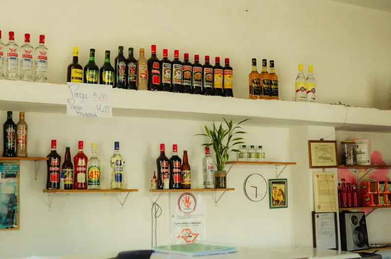
Walk into any liquor store in America and head for the vodka aisle. Somewhere between the crystal-clear minimalist bottles and the ones that look like they were designed by a metal band, you'll find the orange section. And here's the thing: you could blindfold yourself, spin around twice, point, and land on a bottle featuring either a citrus slice, a sunset gradient, or an orange grove at golden hour. Sometimes all three.
We couldn't stop noticing it. So we did what any obsessively citrus-focused editorial team would do — we photographed every orange vodka bottle in three different states, called up a few packaging designers, and asked the question nobody in the industry seems to want to answer out loud: why does every orange vodka bottle look the same?
The Citrus Slice Industrial Complex
"It's a shorthand problem," explains one designer we spoke with, who has worked on spirits packaging for over a decade and asked not to be named so she could speak freely about her clients' competitors. "When a shopper gives your bottle half a second of attention, you need to communicate 'orange' instantly. A wedge of citrus does that faster than any copy could. So everyone uses one. Then the wedge stops being a differentiator and becomes wallpaper."
The math is brutal. Vodka is a neutral spirit, which means the flavor — and therefore the visual identity — lives entirely in the branding. Whiskey bottles can lean on barrels, heritage, amber tones, and frontier mythology. Gin gets botanicals and apothecary vibes. Orange vodka gets... an orange. Preferably sliced. Preferably backlit. Preferably dripping, if the art director is feeling ambitious.
Add in the shelf context and the problem compounds. Spirits brands do their real design work in a retail environment where a bottle might get two inches of visible real estate, partially blocked by a neighbor's shoulder label. Bold colors and simple graphics win that fight. Subtlety dies on a vodka shelf. So the whole category drifts toward the loudest possible version of the same idea — which, ironically, makes everyone quieter.
"It's an arms race where everyone escalated to the same weapon," our designer told us. "Sunset gradient? That's 'warm, natural, California grove.' Except when every bottle is a sunset, none of them feel like anything."
What Actually Works, According to People Who Do This for a Living
When we pushed the designers past the easy critiques, a few themes kept surfacing about what separates a good orange vodka bottle from a forgettable one.
Confidence in restraint. The bottles that read as premium tend to use one strong visual idea instead of five competing ones. A single typographic treatment. One unexpected color choice. Negative space that lets the eye rest.
Typography doing the heavy lifting. Several designers pointed out that the most distinctive bottles in the category differentiate through letterforms, not fruit. A bold, weird, or elegant wordmark sticks in memory long after the citrus slice fades into the shelf blur.
Willingness to be weird. The category's biggest visual sin, per our panel, is playing it safe in the middle. The bottles people photograph and remember are the ones that took a swing — even a swing that misses.
Our Completely Unscientific Shelf Rankings
We lined up the bottles, squinted at them like a shopper at 5:47 PM on a Friday, and ranked. Disagreements welcome — that's what the comments are for.
1. The Confident Minimalist. Every shelf has one: the bottle that skips the fruit entirely and lets a great typeface and an unusual color (we saw a beautiful burnt terracotta) carry the whole identity. It looks like it costs more, and it does. Worth it.
2. The Retro Throwback. One brand leaned all the way into a 1970s supermarket-juice aesthetic — chunky serif type, a hand-drawn orange with a leaf, cream background. It shouldn't work. It absolutely does. It's the bottle you'd keep on the bar cart after it's empty.
3. The Gradient maximalist. Loud, sunset-soaked, aggressively orange. It breaks every rule our designers listed and still wins the shelf from ten feet away. Sometimes volume is the point.
4. The Grove Romantic. Pretty, tasteful, a little generic. It's the bottle equivalent of a nice hotel lobby — pleasant, forgettable, fine.
5. The Clip-Art Casual. A stock-looking citrus slice, a default-looking script font, and a gradient that fades to mud. We're not naming names, but we're all thinking the same name.
Build a Bottle Display That Earns Its Shelf
Since you're likely displaying these at home rather than in a store, you've got advantages no liquor store does: lighting you control, space you can curate, and no requirement to shelve things by category. Our designers offered a few tips for a home bar display that pops.
Curate by color, not brand. Grouping bottles by tonal family — oranges with ambers, clear with clear — creates an intentional gradient effect that looks designed even if you just did it while tidying up.
Light from behind or below. Backlit bottles glow. A cheap LED strip behind your bar shelf turns even the clip-art offenders into stained glass.
Odd numbers, varied heights. Three or five bottles reads better than four or six. Mix tall and short so the eye travels.
Leave breathing room. The single biggest home bar mistake, per our panel: cramming every bottle shoulder to shoulder like a retail shelf. Space is a luxury. Use it.
Let one weird bottle anchor it. Every good display has a conversation piece. If you've got a bottle with an ugly-great label, center it and build around it.
The takeaway from all of this? The orange vodka shelf is stuck in a visual echo chamber, but your bar doesn't have to be. Buy with your eyes, display with intention, and squeeze the day — ideally from a bottle that actually looks like somebody cared.